
Chris Pilsworth’s Business Cards
Let’s take a look at all of Chris Pilsworth’s Business Cards from his career.
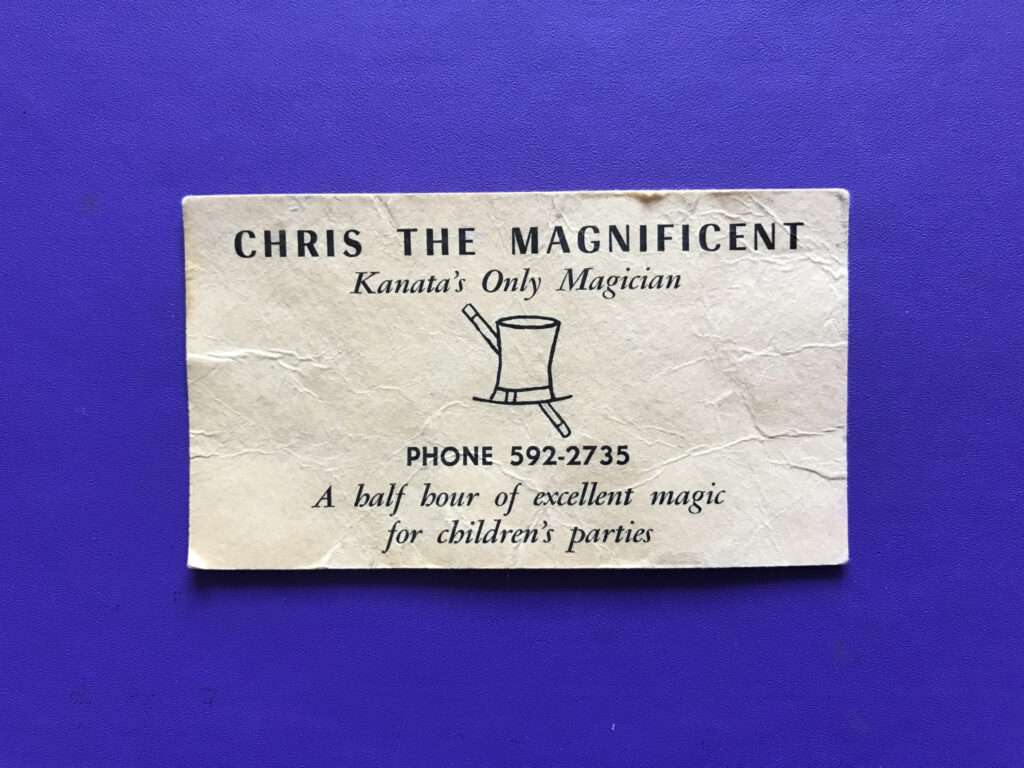
When I first started to perform magic shows, I knew that in order to be in business, I’d need a business card. Because I was 12 and just starting, there was no money in the graphic design budget to create some attractive artwork. From the looks of my first card, you can see that I wasn’t deterred by a lack of funds. I knew that a fancy magician’s name would trump poor artwork. For some reason or other, I’m not sure why I picked a cream coloured card stock. Onwards and upwards.
Chris Pilsworth’s Business Card #2
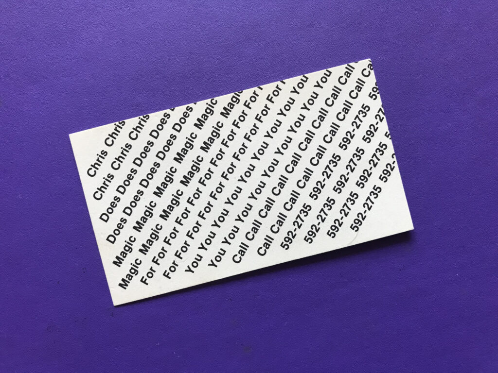
I’m not sure when the second card was produced, but probably after I ran out of the first printing of my first card. My dad had a typesetter create three options for the card below. I felt that this one was interesting and conveyed the appropriate message.
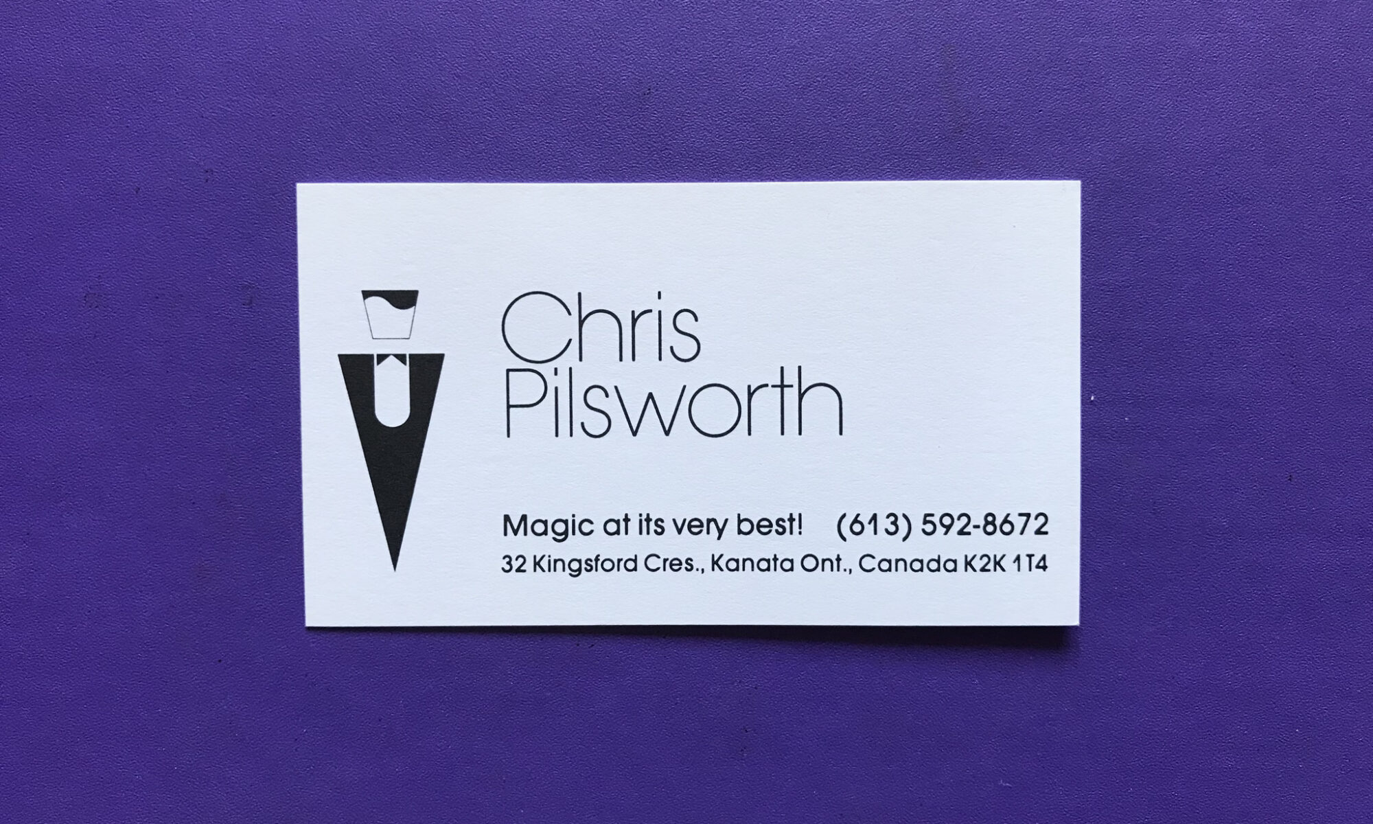
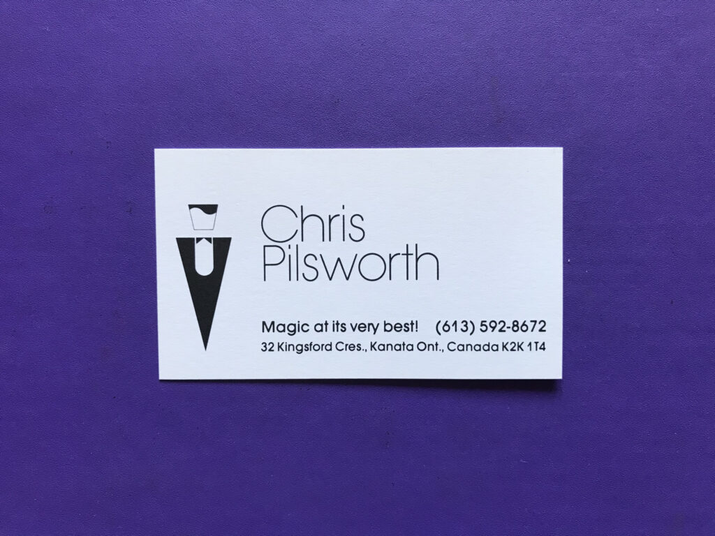
Third Time’s the Charm
By now, I was beginning to realize that a more professional look could lead to more lucrative shows. I designed this one while still studying product design at Carleton University in Ottawa. The logo reflected a crisp look (no pun intended) and also the way I combed my hair. The name “Chris Pilsworth” was created in the Avant Garde font. I’d used it before and liked its elegance. You could also see that I was travelling further from home, as I now included the area code in my phone number.
Hire a Professional
My next card was designed by a friend of mine, Glenn Gobuyan. We were classmates at University and Glenn had worked at the school newspaper. He’s a great graphic designer and has done some amazing work in his consultancy. I love how Glenn took an original photo portrait and converted it into a high-contrast black and white image. The details of the top of the hat and the left pinkie really make the image stand out. The slogan was also carried over from the previous card.

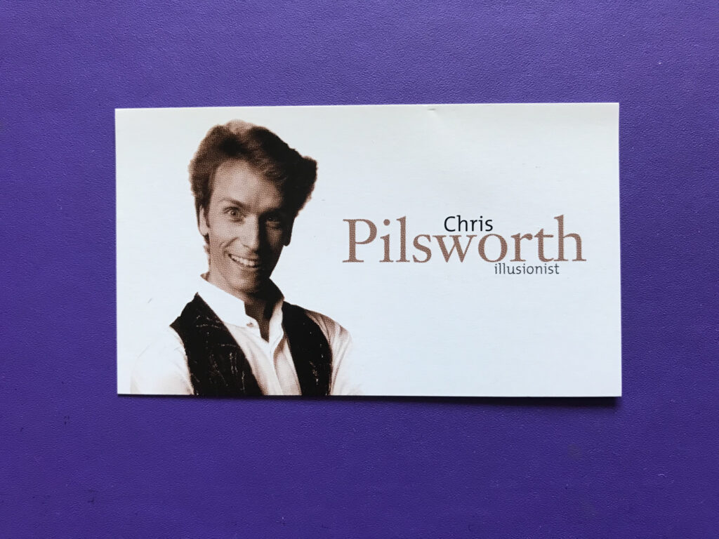
Why not Use a Photo?
The following card was created by Aerographics of Ottawa. David O’Malley’s firm is one of the top graphic design firms in the country. This card was a companion piece to a beautiful two-colour brochure. I love how using black and brown would give the card a life-like feel. This was before high-res computer printers and so full-colour printing wasn’t in my budget range.
How About a Postcard?
When low cost full-colour printing became available, I decided to start using postcards. They were inexpensive and packed a bigger punch. The one below is my current card. Kyle Leon is the designer of this card. He’s a graphic designer and a magician, so he knows how to add some pizazz to a card!

I’ll have a few more cards in my career. I love being able to update the look as I change and my performing changes. Looking at all the cards reminds me of where I started and how far I’ve come since my first card was produced when I was 12.